之前介紹了如何使用matplotlib製作散佈圖,這次要來介紹的是如何繪製棒狀圖。
棒狀圖
在製作棒狀圖時,我們會使用到matplotlib的pyplot.bar功能。
如何使用 pyploy.bar?
首先我們來看一下pyplot.bar的詳細參數。
pyplot.bar(left,
height,
width=0.8,
bottom=None,
hold=None,
data=None,
 **kwargs)
除了上面的這些參數之外,還有一些常用到的參數。
| left(必要) | 各個棒的X軸上的數值(名稱) |
| height(必要) | 各個棒的高度 |
| width | 棒的粗度 |
| bottom | 各個棒的下面的空間 |
| color | 棒的顏色 |
| edgecolor | 棒的邊緣的顏色 |
| linewidth | 棒的邊緣的粗度 |
| tick_label | X軸的名稱 |
| align | 棒的位置的制定 |
| log | True的話會出現指數圖表 |
| xerr | X軸方向的Error bar(誤差) |
| yerr | Y軸方向的Error bar(誤差) |
| ecolor | Error bar(誤差)的顏色 |
| capsize | Error bar(誤差)大小 |
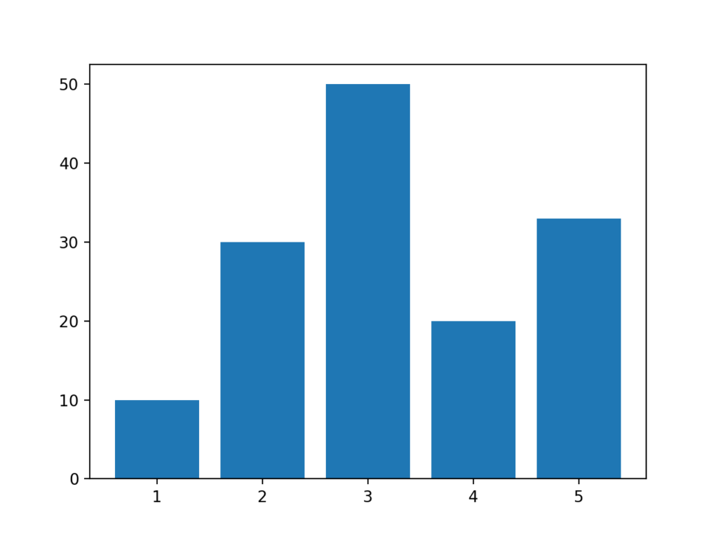
繪製基本的棒狀圖
接著我們來看看如何繪製基本的棒狀圖!只要使用pyplot.bar()就可以做棒狀圖。必要的參數有X軸的各個棒的名稱(數值)以及,各個棒的大小(Y軸)。也就是left以及height。
import numpy as np
import matplotlib.pyplot as plt

left = np.array([1, 2, 3, 4, 5])
height = np.array([10, 30,50, 20, 33])
plt.bar(left, height)
plt.show()
執行結果會像下面這樣。
更改棒狀圖的設計
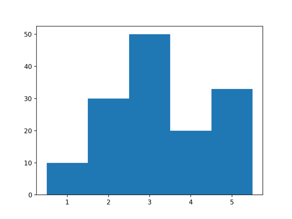
變更棒狀圖的粗度
在剛剛上面的參數部分有提到,只要調整width這個參數就可以調整棒狀圖的粗度。width的默認值是0.8,因此每個棒之間都會有間隔,如果把width調整成1的話各個棒之間的間隔就會消失。這裡我們只要在代碼之中加入一句width=1就可以了。
import numpy as np
import matplotlib.pyplot as plt

left = np.array([1, 2, 3, 4, 5])
height = np.array([10, 30,50, 20, 33])
plt.bar(left, height, width=1.0)
plt.show()
輸出結果
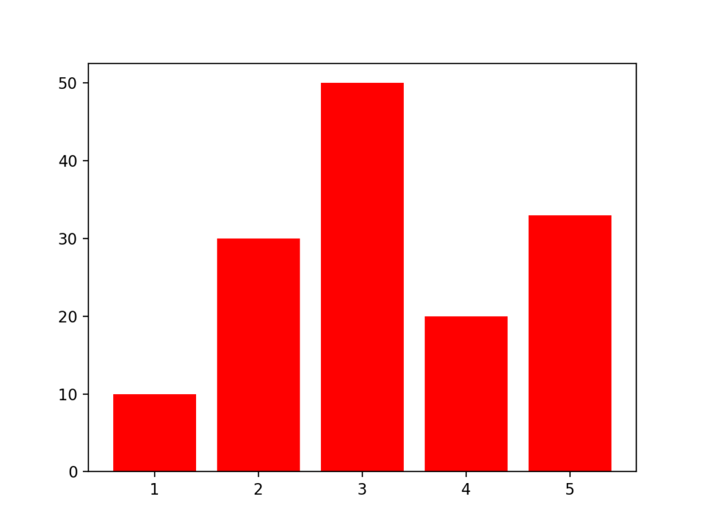
調整棒的顏色以及邊緣的粗度
接著我們可以用color來調整棒的顏色。棒的邊緣的粗度則可以用linewidth來做調整。另外如果將linewidth調整為0的話可以將緣線消失。
import numpy as np
import matplotlib.pyplot as plt

left = np.array([1, 2, 3, 4, 5])
height = np.array([10, 30,50, 20, 33])
plt.bar(left, height, color='red', linewidth=0)
plt.show()
執行結果
調整邊緣顏色
接著我們試著把邊緣的粗度調整成2,來試試看把邊緣的顏色也做改變。顏色的部分可以用edgecolor來調整。
import numpy as np
import matplotlib.pyplot as plt

left = np.array([1, 2, 3, 4, 5])
height = np.array([10, 30,50, 20, 33])
plt.bar(left, height, color='red', linewidth=2, edgecolor='orange')
plt.show()
執行結果

指定棒的位置
棒的位置可以透過align來變更。如果align的值是edge的話棒會移到邊緣,center的話會維持在中間。
import numpy as np
import matplotlib.pyplot as plt

left = np.array([1, 2, 3, 4, 5])
height = np.array([10, 30,50, 20, 33])
plt.bar(left, height, color='red', linewidth=2, edgecolor='orange', align='edge')
plt.show()
執行結果

調整X軸的名稱
使用tick_label可以調整X軸的名稱。在這邊我們另外生成一個變數labels來作為名稱。
import numpy as np
import matplotlib.pyplot as plt

left = np.array([1, 2, 3, 4, 5])
height = np.array([10, 30,50, 20, 33])
labels = ['apple', 'banana', 'coconut', 'dragon fruit', 'eggplant']
plt.bar(left, height, color='red', linewidth=2, edgecolor='orange', tick_label=labels)
plt.show()
堆積棒狀圖
堆積棒狀圖
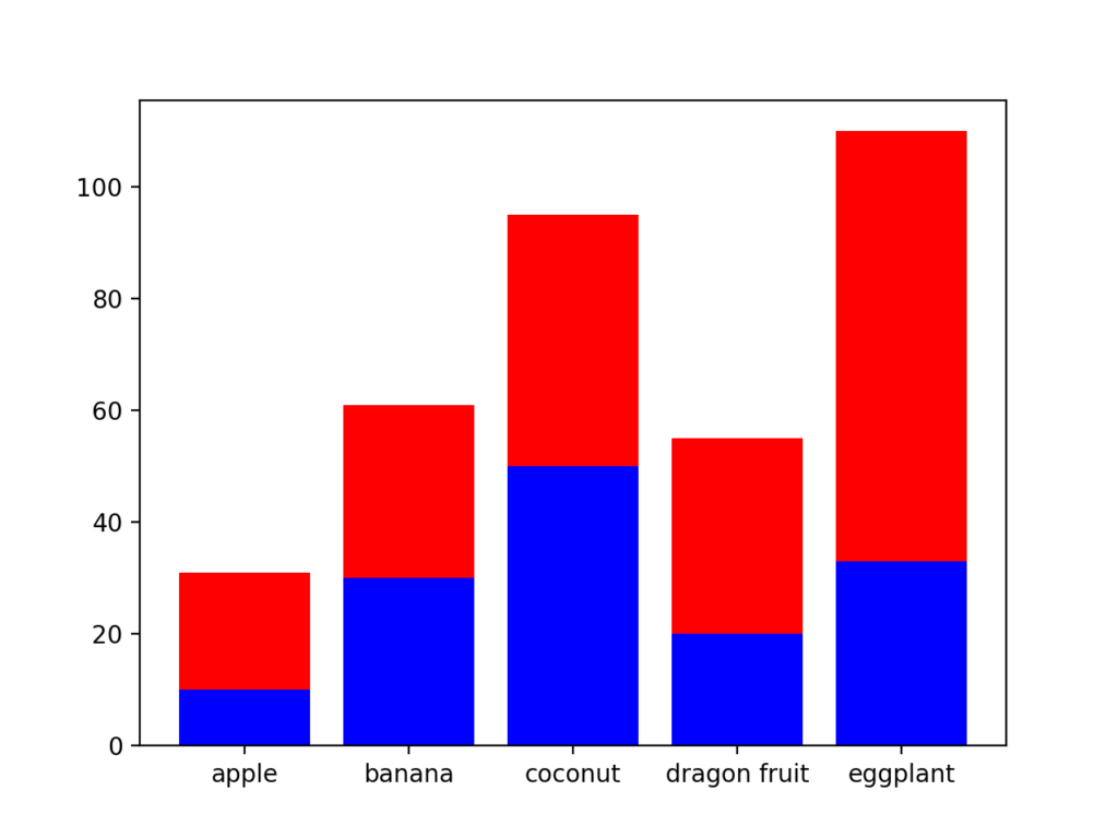
除了基本的棒狀圖以外,接著要來介紹堆積棒狀圖。我們要先製作兩個棒狀圖,然後指定要在上面的棒狀圖並且設定參數bottom,接著選擇要在下面的棒狀圖。一開始可能會覺得有點複雜,不過可以挑戰看看!
import numpy as np
import matplotlib.pyplot as plt

left = np.array([1, 2, 3, 4, 5])
height1 = np.array([10, 30,50, 20, 33])
height2 = np.array([21, 31,45, 35, 77])

labels = ['apple', 'banana', 'coconut', 'dragon fruit', 'eggplant']

#選擇要在下面的棒狀圖 blue
plt.bar(left, height1, color='blue', tick_label=labels)

#選擇要在上面的棒狀圖 red
plt.bar(left, height2, bottom=height1, color='red', tick_label=labels)
plt.show()
執行結果
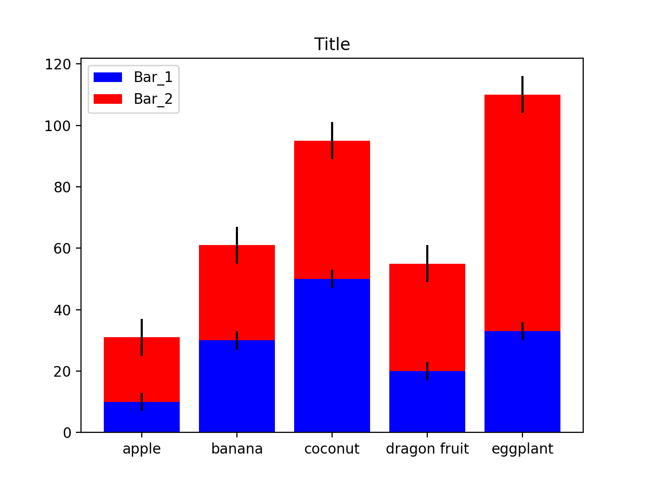
堆積棒狀圖的圖例,標題,Error bar(誤差)
製作一個完整的堆積棒狀圖會有上述的幾個項目。在這邊我們試著讓剛剛製作的堆積棒狀圖更加完整。在這邊我們設定誤差分別是3以及6。
#!/usr/bin/env python
# -*- coding: utf-8 -*-

import numpy as np
import matplotlib.pyplot as plt

left = np.array([1, 2, 3, 4, 5])
height1 = np.array([10, 30,50, 20, 33])
height2 = np.array([21, 31,45, 35, 77])

labels = ['apple', 'banana', 'coconut', 'dragon fruit', 'eggplant']

#選擇要在下面的棒狀圖 blue  誤差3
bar1 = plt.bar(left, height1, color='blue', yerr=3, tick_label=labels)

#選擇要在上面的棒狀圖 red   誤差6
bar2 = plt.bar(left, height2, bottom=height1, yerr=6, color='red', tick_label=labels)
plt.title('Title')
plt.legend((bar1[0], bar2[0]), ('Bar_1', 'Bar_2'))
plt.show()
執行結果

摘要
這次介紹了如何使用matplotlib的bar功能,以及堆積棒狀圖的製作方式。下面幾點是在製作棒狀圖時需要記住的事!
- 用plt.bar()來做棒狀圖。
- 可以變更棒狀圖的顏色,位置,緣線等等
- 利用plt.bottom()可以製作堆積棒狀圖

留言